
FUNDAMENTALS OF VISUAL LANGUAGE - 2
- deepikagupta20
- Oct 11, 2020
- 2 min read
ILLUSTRATED GLOSSARY:
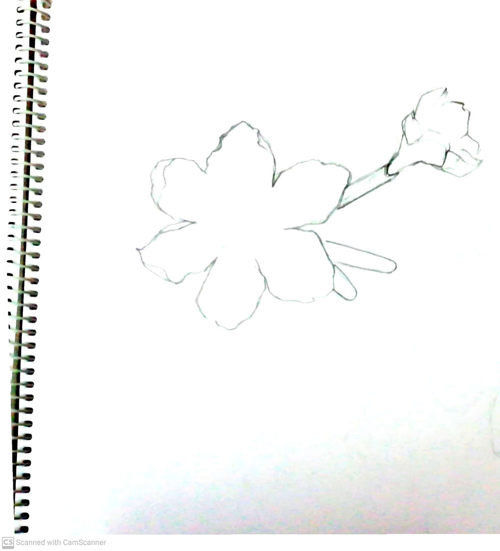
1. Contour - It is an outer line which represents a shape or form.
2. Complimentary colors - They are those pair of primary colors which when mixed together form a grayscale scale color and that is complimentary to the the color other than those mixed. For example, Red+ Blue = Violet which is complimentary to Yellow.

3. Tonal Variation - It refers to the various tints and shades that are present in an object according to its brightness and darkness to give it a 3D look.

4. Sepia - It is a reddish brown color.

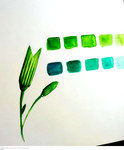
5. Monochromatic hue - Mono means single and chrome means color which put together means a single color with its brightness and darkness in it.

6. Cross-Section - When we cut an object either horizontally or vertically to do a detailed study about its inner parts with reference to the outer parts.

MEDIA EXPLORATION:
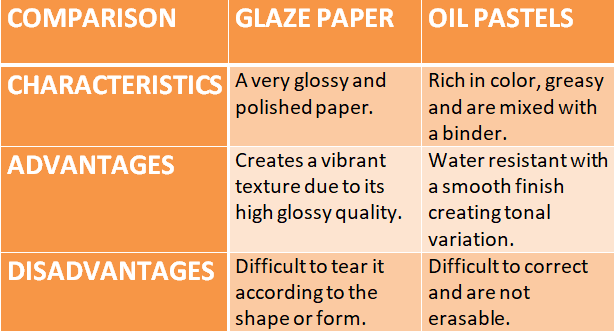

Among the above two mediums oil pastels proved to be the most effective for me because:
They are easy to work with due to their smooth finish.
Since they are made using a binder these colors provide good coverage and rich color.
Although they are a bit greasy, they can be easily blended to create tonal variations.
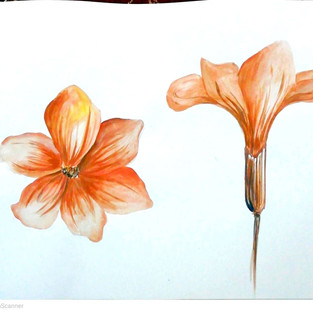
The medium that I found myself most comfortable in working with is 'Watercolor' because:
Watercolors are transparent and gives the painting a beautiful effect of light and shadow.
They are easy to use and the necessary mediums are easily available in the market.
Watercolors as the name suggest use a lot of water to create the desired tints and shades and sometimes create beautiful textures.
They work in layers which allows one to correct their mistakes in the next layer.


CONCLUSION: Learning Experience, Helping aspects and Struggles
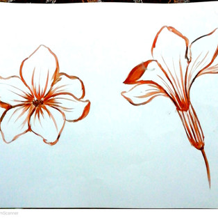
This project proved to be really helpful as it enabled me to study the various visual aspects of a flower/organic form and broadened my observation skills.
During the course of this project I understood the advantages and challenges of using each medium.
Restricting myself at first with mediums like glaze paper and charcoal and then moving onto more simpler and free mediums like pastels and water colors was the one aspect that really helped me in learning.
Even though using glaze paper was quite a struggle, I was able to overcome it by constantly trying it again and again until I was satisfied.
The overall experience of exploring different mediums was filled with creativity and no limit. It goes deeper than the shades of the colors.
REFLECTION:
Below are my best 24 works (4 works from each day) of our 6 day activity.
The various mediums used were:
Pencil
Charcoal
Black Waterproof Ink
Glaze papers
Soft pastels
Oil Pastels
Watercolors


Comments